01 Nov Interview with Artist Mary Kuper

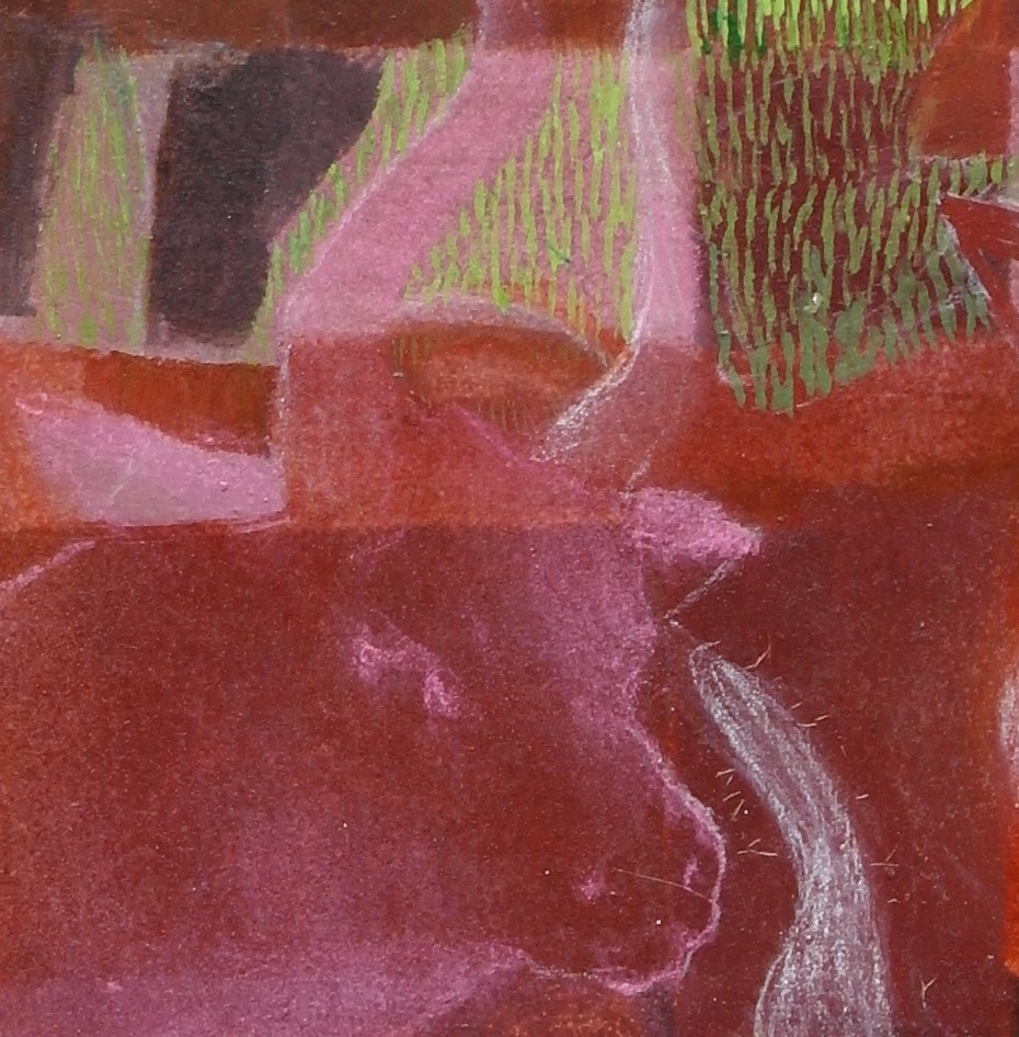
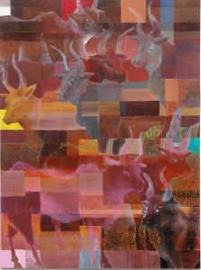
Cattle Coloured by Mary Kuper 2020
Mary Kuper’s The Colour of Words is a fascinatingly in-depth exploration of the words used to describe colour between colours and cultures, set against vividly coloured canvasses showing people, animals, plants, landscapes and abstract blocks of colour. The text and images can be viewed at the art shop Russell & Chapple as part of Bloomsbury Festival, or online. Mary kindly agreed to an interview with the Colour Group (GB) for this blog. (Interview by Rox Middleton.)
Thanks for agreeing to talk to us Mary – we were really excited by the work you’re showing at the Bloomsbury Festival. Can you tell us a bit more about your inspiration for the project and how it came together?
As an illustrator, I do have a longstanding interest in colour – but I don’t consider myself a colourist. This project came about as a collaboration with ELAR, the Endangered Languages Archive at SOAS and the Bloomsbury Festival. The festival theme was ‘Vision’ and I decided to do work about the naming of colours across cultures and languages. This is a particularly interesting area for cognitive linguistics in the debate between linguistic relativists and universalists, with the universalists arguing that all languages name colour according to a similar pattern. The universalist argument was articulated by Berlin and Kay in the 1960s and for some time people have been reacting against that. I think the debate itself is interesting, but I came across a perceptive summary of the argument along the lines that it depends on how much you are invested in establishing how similar or how different people are from one another. This is quite ideological and helps explain why the debate is often heated.
So then you set about doing the research on the colour words and linguistics first?
Yes, and it was a lot of research – originally I was hoping to work closely with someone at SOAS, but then of course the lockdown happened, and I had to be a lot more independent – I was very free to research as I liked, but people spend their lives researching a single language and there I was skimming through it relatively quickly, so there’s definitely an anxiety about getting it wrong. That’s why I’ve used a lot of quotes – in linguistics you can’t summarise without paying attention to the very tiny distinctions and the precise cases for each colour name and each language. This meant that I had to quote verbatim big sections of the research, which made the text accompanying the images quite wordy. If anyone is interested in learning more themselves, I’d recommend The Semantics of Colour by Carole Biggam, which is where a lot of my research grew from.
How do you see the pictures and the text that you’ve written interacting with each other? Looking at both, they seem independent but complementary.
My first thought was to make a colouring book and ask how people in different cultures might colour them in differently – but that wouldn’t work because we all see the same colours it’s just that we have different words for them. There were languages mentioned in my research that had as few as 2 colour names and I started to be curious about what was the largest colour naming vocabulary and found that there are 600 words for dry powder pigments, so I thought they would be really interesting to look at and to work with. The most interesting thing is that many of the names of the pigments don’t really tell you what colour they are at all – Antwerp Blue is really very green and Mars Violet is an incredible dirty red. So I got hold of loads of these pigments, thanks also to the people at Russell and Chapple who are showing the work, because some of them are extremely expensive. I’ve not painted with pure pigments before so learning to do that was also a process of experimentation and acquiring lots of new skills. They differ hugely in density, so for some, the bulk of ten grams is enormous, and for others ten grams is just a tiny little jar. But they are brilliant – you can make anything with the dry pigment powder, depending just on what medium you want to use – tempera, acrylic, oil, watercolour, whatever you like. There was so much to learn, it was totally absorbing.
How did the research that you done inspire the paintings?
The paintings are really each illustrations of the colour words as they are described in particular contexts – taking the white one as an example, there are three words for white in Martu Wangka, a language spoken in the Western Desert in Australia – no abstract universal idea of ‘white’, but instead the white of a gum tree or of a dog or of a clay pit. I wanted to illustrate the representations of the words and by doing that, to translate the language back into colour. In the red picture, I’m looking at a language spoken in the Yucatan peninsula and northern Belize where colour words include much more information than hue. I tried to get the red of all of the different ideas like a wet red, a flat expanse of red, the red of a rash, the red of tiny clustered objects…
Then there’s the eye painting that has all the different colours?
Yes, that was interesting because that’s where I realised that the pigment names are not very descriptive of the actual colour. I didn’t go very far into how each of the pigments got its name- that would be another project, but in particular say in yellow-red-orange, in identifying the focal, the typical representative colour. Many colours that have ‘yellow’ in their names, like Cadmium Yellow Mid, I would call orange, as I would ‘Red Minium’.I grouped the pigments around the eye by name, and this was quite misleading, but I decided to stick to it, even if pure Alizarin Crimson, for example, which I thought would be quintessentially red, was actually quite brown.
How has it been having an online exhibition as well as the real life one? Have you had feedback from it?
I prefer the exhibition online actually, because it needs to sit inside the text somehow and in the real exhibition the text is there but I don’t think you read it in the same way, because reading the whole A4 sheet standing in the shop, it’s a bit much.
I’ve had some feedback, but not a lot, it’s not like an exhibition where you can invite people, so there have been points where I asked myself why am I doing it but in the end it’s because I have been so interested in it. I like it when we realise things we take for granted are completely skewed by cultural context and although we walk through life oblivious to this much of the time, something like this work is a chance to see differently. When you realise that the question isn’t ‘Why is the sky blue?’, but ‘Is the sky blue?’ And the answer–happily – is ‘It depends.’
I like the fact there are these things we think of as universal, but we realise that they aren’t. I also like taking language and trying to visualise it – because language to me is quite concrete.
Has the work you’ve done affected how you see colour in your everyday life?
Yes it has! I think what I’ve learnt about colour has really got into me – when I look at the sky now, I start thinking what pigment will match it. I am obsessed with Mars Violet, I really want the chance to look at Mars through a telescope and find out if it’s really that colour and that’s how the pigment got its name. I’ve also understood some things about how pigments are made – and how to mix and layer them. I certainly think about colour differently now, and I’m glad because like a lot of people who make pictures, you have a palette that gets kind of stuck, so I hope that this will make mine more interesting – anyway I have a lot of pigment left over.
Are you a colourist now?
I still wouldn’t describe myself as a colourist – what I like to do is not purely about materials. I’m a bit better at colour now, but I am an illustrator at heart – not someone who could lose myself in a whole canvas of abstract colour.
Do you have a favourite colour? – Can anyone really have a favourite colour?
It’s an interesting idea, because it’s so coloured by our expectations of ourselves – our understanding of the meaning of colour. For example a lot of people like black, but wouldn’t say it was their favourite colour because of the negative associations. If I have to choose I would say blue, but a lot of that is because when we were very little, I was dressed in red and my sister was dressed in blue. So when I became an adult, dressing in blue was partly to do with my autonomy. Beyond that, you really can’t separate colour from context – My favourite colour is probably the colour of the sea when the sun hits it, but I wouldn’t call it blue.
Where next for your colour work?
I’m really interested in Persian and Moghul paintings, I was looking at some of them recently and the colours are extremely intense, I could recognise some of the pre-synthetic pigments that I’ve been using in them, and I’d like to try using pigments for illustrative work at a smaller scale. I’ve been working with language for a while now, and that’s something I will be working on more, words are so full of images.
